
![[Fire Emblem: Fates] Selkie - Respite at the Beach by Estra-sh](https://images-wixmp-ed30a86b8c4ca887773594c2.wixmp.com/f/84e968ec-4b71-4969-9017-f4470527ecf1/dbcq1kx-4a9a6f60-663e-4b9d-9827-b48475336c4d.png/v1/fill/w_894,h_894,q_70,strp/_fire_emblem__fates__selkie___respite_at_the_beach_by_estra_sh_dbcq1kx-pre.jpg?token=eyJ0eXAiOiJKV1QiLCJhbGciOiJIUzI1NiJ9.eyJzdWIiOiJ1cm46YXBwOjdlMGQxODg5ODIyNjQzNzNhNWYwZDQxNWVhMGQyNmUwIiwiaXNzIjoidXJuOmFwcDo3ZTBkMTg4OTgyMjY0MzczYTVmMGQ0MTVlYTBkMjZlMCIsIm9iaiI6W1t7ImhlaWdodCI6Ijw9MTYwMCIsInBhdGgiOiJcL2ZcLzg0ZTk2OGVjLTRiNzEtNDk2OS05MDE3LWY0NDcwNTI3ZWNmMVwvZGJjcTFreC00YTlhNmY2MC02NjNlLTRiOWQtOTgyNy1iNDg0NzUzMzZjNGQucG5nIiwid2lkdGgiOiI8PTE2MDAifV1dLCJhdWQiOlsidXJuOnNlcnZpY2U6aW1hZ2Uub3BlcmF0aW9ucyJdfQ.qGY12xR11YCR_1xZWdaH7E0jY5PpO2PKaRK8hDr00ZE "[Fire Emblem: Fates] Selkie - Respite at the Beach by Estra-sh")
First Impressions
I like how clean the picture is. Especially the lineart.
My first guess would have been that it's a pinup. A sexy character in a sexy outfit and a seductive pose. The sideways and upwards glance reads as flirty to me. And the hand gesture reminds me of that false savagery that some people find sexy. And in a closer reading I also see that the tail is wrapped around to point directly at her groin - I'm not sure that you completely intended it, but it's very suggestive.
At the same time her swimsuit and attitude are not as slutty as I've come to expect from anime fanart. So maybe it's more of an innocent playful beach moment than a pinup.
I think you've managed to capture the sunny beach mood quite well... if one ignores the position of the sun. If the sun is that low on the horizon it should be sunset/sunrise and we would expect a lighting situation closer to this

or this

By Sasha Kargaltsev from New York, US (Flickr Uploaded by Fæ) [CC BY 2.0 (creativecommons.org/licenses/b…)], via Wikimedia Commons
[The lighting in these two pictures is actually the same but one is exposed for the sky and the other for the foreground. If you don't know what exposure is, it's basically the amount of light that you let into your eyes/camera and it determines the range of brightnesses that appear in your image (called the "dynamic range").]
But I think that a midday sun would better suit the idea of the painting and the solution is simply to put the sun higher which means out of frame (which also saves you the awkward exposure problem).
lighting and shading
shading fundamentals
One of my main criticisms for your work is that your shading does not properly describe how the lighting in the scene interacts with the 3D objects and therefore you're having problems with things not looking 3D enough.
It's pretty clear to me that you're lacking a bunch of fundamental knowledge on how to shade a drawing with the purpose of describing a 3D object.
I invite you now to open Proko's Video Library in a new tab and to watch the videos in the Drawing Basics category called "The Basic Elements - Shape, Value, Colour, Edge", "Shading Light and Form - Basics", "How to Shade a Drawing" and "Structure Basics - Making Things Look 3D". Please take notes and draw along so that you actively assimilate the knowledge. This is fundamental stuff and I'm going to assume you know it in the rest of the critique, so don't continue reading before you have watched them.
With that knowledge you should be able to understand that the main mistake you are doing is that you are placing shadows and highlights arbitrarily instead of starting by choosing a light source and then figuring out where the shadows and highlights need to be given the 3D shape.
Let's take this exercise of yours for a simple couple of examples:
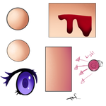
- The bloody wound doesn't look right because the light isn't consistent: it seems to be coming from below for the skin and from above for the blood.
- the bottom ball looks less round than the top one because the terminator isn't correctly placed
Those are the two things you most need to practise in my opinion
- keeping consistent lighting throughout your image
- correctly placing your terminators

The third one is getting the intensity of the shadows and light right. This is a little more tricky and less of an exact science. One thing to know, however, is that hierarchy is more important than absolute values. In other words, rather than trying to get the perfect brightness for each spot, start by making sure that the places that should be the darkest and the brightest are indeed the brightest and darkest and that the places that should be clearly darker than others are so.
highlights
I'm going to talk a little bit about highlights because you specifically asked me to:
Do you know how to correctly place highlights? ( hair, wet surfaces, skin) I know that they give more dimension but I never seem to get them right.
Let's start by properly defining "highlight" because there are multiple definitions.
- There's a first broad definition: a highlight is a stroke that lightens the picture.
- Artists also often like to simplify the values of their image by grouping them into just a few categories, typically three: shadows, midtones and highlights. This is extremely useful and translates into one of the most popular workflows for rendering a painting: start by blocking in with midtones, add a shadow layer on top (usually called the shading phase), add a highlights layer on top.
- If an object is semi-reflective, the brightest spot on it is often the reflexion of the light source. This is often called the highlight. To avoid confusion, I prefer to use the term that is used in 3D rendering software: specular highlight.
Seeing as you mentioned hair, wet surfaces and skin, which are all more or less reflective surfaces, I suppose that you meant definition 3: specular highlight.
One thing that I want to make very clear is that the specular highlight is not the same thing as the centre of light. You can re-watch this video, if that isn't clear in your head (starting from around 7:10).
And no, you are quite close to completely wrong: specular highlights do not give more dimension.
The core shadow, the center of light and the bounce light all give a sense of 3D if they are placed correctly and have the proper values, because they describe the local orientation of the surface (aka "plane changes" in more artistic and less mathematical terms).
The specular highlight, however, mostly describes the reflectivity of the surface. In general it actually tends to hurt the dimensionality of the drawing because it breaks the structure of the planes going from light to dark as they turn away from the light source.
[There is one exceptional case where the highlight can describe the 3D shape, and that is if the highlight has an elongated shape that wraps around the 3D form]
- Basics of Specular Highlight Theory
The phenomenon behind specular highlights is the exactly the same as what happens with a mirror: light hits the surface at a certain angle and bounces off at the same angle from the normal to the surface, but on the other side of said normal.

The thing with semi-reflective surfaces like skin or hair is that only a portion of the incident light is reflected that way. This means that only the brightest parts of the environment will appear to reflect on that surface. For those kinds of surfaces we don't see a full reflexion of the environment but instead we only see highlights which are the reflexion of the light sources and other very bright parts of the environment.
The only way to determine where the specular highlights are on your surface is to find where the light from your light source needs to bounce on your surface in order to fall directly into the view point and you do this by imagining (or literally drawing) rays of light bouncing off the surface.
It is not important to be super precise about this.
This ray-bouncing method will give you the position of specular highlights on perfectly smooth/polished surfaces. If your surface has some level of texture (99% of surfaces do), then the highlights will tend to spread and become blurry. This is often referred to as the specularity of the highlight. The more texture, the more the highlight spreads and becomes blurry.
If the texture has a random, noisy grain, then the highlight will spread in all directions.
If the texture has direction - which is typically the case of hair - then the highlight only spreads perpendicularly to the direction of the texture. This explains the bands of highlight that you see on people with shiny, tidy hair.
- Specular highlights and rim light
One thing you did here is to draw a highlight that outlines almost everything.
It kinda works and kinda doesn't.
From what I gathered, you took that idea from this tutorial.
[I highly recommend to avoid this kind of step-by-step, hardly-explained tutorials at all costs. They only tell you how to do things but no why it works, which means you will be unable to twist the technique properly to the needs of your own drawing.]
The thing to know is that surfaces tend to reflect more light if the angle of incidence is high i.e. the rays of light are nearly parallel to the surface. You can think of it as light doing a ricochet off of the surface.
Therefore, rounded and semi-reflective surfaces with a bright background will often have an outline of highlights.
But you have to remember that the highlight is just the reflection of the background. Therefore we can't have those highlights be brighter than the background like you do here.
You can see all this happen in the picture below. The highlights outlining the left of the forehead, cheekbone, nose and chin or outlining the right part of the arm are caused by the background reflecting on the skin because of the high angle of incidence of the light.
You don't always need the whole background to be bright, you can just use a light source behind the subject. Photographers and filmmakers often use such a light source to outline the part of the subject that is in the shadow of the main light source. It is called a rim light and it usually looks beautiful and dramatic. In that case, the highlight does form an outline but only on the side of the light as opposed to on all sides when the whole background is bright.
If we accept that the sun being where it is in your picture without becoming blinding (as it should be), then it can indeed act as a rim-light and the intensity of some of your highlights kinda makes sense. However we still have to take into account that the light needs to bounce off the surface and into the viewer's eye. The sun is in the top-left so planes that are facing bottom or right should not be catching the highlight.
colour
You talked quite a bit about colour in your note.
Colour is a very vast subject.
I'm going to try to give you the most fundamental and useful tips. If you want more highly rigorous theory, you can read huevaluechroma.com later.
There are a bunch of ways of analysing colour, but the most practical for us artists is to break down colour into:
- value
- hue
- chroma or saturation
Value is basically how light/dark a colour is. It's what you have left when you turn an image to grayscale.
Chroma and saturation are similar but different ways of defining how colourful a colour is or, in other words, how far from grey that colour is.
The hue of a colour is defined by the closest high chroma colour. High chroma colours are the colours of the rainbow + magenta (and the other colours between violet and red). They are often represented as a spectrum or colour wheel. Some people like to think of it as the "colour of a colour".
In digital painting software, you usually have a bunch of different settings for your colour picker. I recommend using the one called HSB (hue, saturation, brightness).
It will look something like this:

or this:

Note: this also sometimes called HSV (hue, saturation, value), but there is a significant difference between the definition of value I gave above and the brightness axis here.
At equal brightness, colours with lower saturation have higher value.
Brightness does not properly convey how light a colour seems to our eye. Only value does.
If you turn down the saturation to zero on the hue spectrum strip of the above colour picker while maintaining the brightness constant, all you would get is a completely white strip. However, a more intuitive grayscale version would be something like this:

which better represent our perception of the lightness of colours.
This is what I call value and it's important to understand that idea and be comfortable with it because:
Value is the most important part of colour.or this:
Note: this also sometimes called HSV (hue, saturation, value), but there is a significant difference between the definition of value I gave above and the brightness axis here.
At equal brightness, colours with lower saturation have higher value.
Brightness does not properly convey how light a colour seems to our eye. Only value does.
If you turn down the saturation to zero on the hue spectrum strip of the above colour picker while maintaining the brightness constant, all you would get is a completely white strip. However, a more intuitive grayscale version would be something like this:
which better represent our perception of the lightness of colours.
This is what I call value and it's important to understand that idea and be comfortable with it because:
It's essential to know that. Value is the first information that our brain reads. You can turn most images to grayscale and still retain readability. Most great images can be turned to grayscale and will still look great.
If your values are good, then you can get away with a lot colour "mistakes". If your values look bad, hues and saturation will not save you.
Values are the most powerful tool for us artists. Therefore when you're painting, it's important to be very careful about your values.
With digital tools you can literally turn your picture to grayscale temporarily to check how thing are going if you are not very comfortable with thinking in terms of values on a colour image.
It's important to understand where values come from.
Values are made by light interacting with 3D objects that have local colour
This is precisely what we talked about in the previous "shading and lighting" part of the critique. And I really think you should practise this in priority.
Here's what your drawing looks like in grayscale

I hope you can agree with me that there is no convincing sense of light and that it looks a little flat.
Solving that is all about values. Not colour.
shading and colour
So we've talked about how light + 3D = values
What we haven't talked about is how light interacts with the rest of colour.
A first thing to understand is that lights have colour and that that colour influences the perceived colour of illuminated objects.
Perfectly white light does not exist and therefore we have this fundamental rule of painting:
How does light affect colour? It's actually remarkably complex if you want to be rigorously scientific about it (cf. huevaluechroma.com for proper theory).
To over-simplify things, you can say that the colour of the object will shift towards the colour of the light on the colour disc while also becoming lighter in value.
The tricky thing is how light interacts with saturation/chroma.
Value and saturation/chroma are not independent.
Higher values only exist at lower saturations.
When the intensity of the light is very strong or when you shine a light on an already very bright object, colours will burn out to white and therefore lose saturation. This happens even if the light and/or the object have very saturated colour.
This can be quite counter-intuitive. A bright enough perfectly saturated red light (like a laser, for example) shone onto a bright red surface (like a tomato for example) can actually appear white, i.e. completely de-saturated and not red at all.
In short, when the intensity of light increases, value (and brightness) continuously increase but chroma (and saturation) initially increase and then decrease.
You will find all the proper theory for how light works on huevaluechroma.com however not all of that is necessary to make beautiful artwork.
I'll repeat once again: value is the most important part of colour; and this is especially true when shading coloured objects under coloured lights.
How to make better colour choices
To make better artistic choices (not just concerning colour) there is one simple question to ask yourself:

The question is simple. Finding the answer is not always easy.
In other words, you need to have a strong reason for everything you do.
The beginning of the answer is always: because the viewer will appreciate the image more if I make that choice.
Here are some other tools to help you choose colours:
In other words, you need to have a strong reason for everything you do.
The beginning of the answer is always: because the viewer will appreciate the image more if I make that choice.
Here are some other tools to help you choose colours:
e.g. in my culture, red symbolises both positive things like love or bravery and negative things like violence.
However, if the audience have enough clues to properly interpret your symbolism, then this can have a great effect.
This means creating a context or placing your artwork in a context where the symbolism is easy to interpret.
For example, if you want to design a violent character, then using red might be a good idea, however if the red is the only thing that signifies violence, then it won't work: the viewers need other clues.
When choosing colours it's important to remember that they shouldn't be chosen separately but rather in relation to the other colours in your artwork.
The two key concepts to have in mind are the two main concepts of composition : unity with variety.
Unity creates a sense of purpose, of meaning and is essential to creating a sense of calm or harmony. However too much unity creates boredom.
Variety creates visual interest and grabs the attention, it's essential to creating a sense of activity or tension. However too much variety creates messiness and can even be exhausting to look at.
There is a reason for the word "with" in "unity with variety". A lot of the work of composition is finding the right balance between unity and variety in your image.
Another way to think about it is in terms of contrast. Contrast will grab the attention and you can use that to make your image eye-catching and also to make the important parts of your image look important and make sure that the viewer doesn't miss them.
So when you're choosing colours, the main question to ask yourself is how much do you want it to stand out from its surroundings and from the whole picture.
Colours of light are extremely important to think about, often more than the local colours of objects. If rendered properly, a strong coloured light source can unify the colours of a scene and create nice value contrast at the same time, whatever the local colours in the scene are. For example, this is the reason why nearly anything looks good under sunset light. Humans aren't much different from stupid moths: we're attracted by pretty lights.
 by simbalm")
In your piece here, the colours you used suggest a sunny midday lighting situation which fits the vacation theme pretty well.
Apart from the inconsistent position of the sun and rendering of the light on the character, I think the lighting mood works well.
The only other colour choices you had here were essentially the colours of the swimsuit.
The bright orange contrasts a lot with the blue background, so it commands a lot of attention. To me it suggests that the character is not very shy and likes attention.
That contrast also makes the image more lively and visually active which suits the mood you wanted to create, I think.
My main criticism is that it breaks the original character and world concept. The colour palette for Selkie's original outfit looks nothing like the orange and black you gave her bikini and the design and colours really don't feel to me like they belong in the medieval fantasy world of Fire Emblem. Of course, you can decide that that's secondary to creating a lively colourful mood. However, fan art usually benefits from being well tied in with the original material, because fans like to recognize things and tend to dislike when you break away from the source.
I want to end this section on colour by saying that we've not really tackled colour theory for artists completely. I've just scratched the surface, which is frustrating to me because I like complete and rigorous explanations. I can totally understand if some parts of this section seems blurry. As I've said before, all the proper scientific theory can be found here: huevaluechroma.com. However, you'll find that it's quite indigest and there's a gap between understanding the science and applying it efficiently in your drawings. If you've got a little money to spend I recommend the different realism and lighting and colour classes over at Schoolism, which will teach you much more practical techniques.
However, more importantly, I want to repeat: value is the most important part of colour. The first thing you need to worry about is values or, in other words, making drawings that look good even when turned to grayscale.
backgrounds and environments
backgrounds
You told me:
most of my drawings lack backgrounds which makes them really stale in my opinionI disagree with this statement. Lack of background does not make a drawing stale.
Out of the four inspirations you sent me, two have a uniformly coloured background, one has a simple pattern and one is a landscape. None of them have a character placed in an environment like you did here and yet that does not make them stale.
Let's start with a definition clarification. There is a difference between background and environment. Most of your drawings are character portraits and portraits cannot "lack" a background; they automatically have one : the part of the canvas that isn't occupied by the character. However, portraits can lack an environment/setting and have an abstract background instead.
The thing that characterizes a background is that it supports the main subject of the picture.
There are a bunch of ways for the background to do that.
- The first use of a background is to direct attention the interesting parts of the subject. The main concept at play here is contrast. You want your main areas of interest to have the most contrast.
However, you want to avoid what happens in the image below, where the area of the picture that has the most contrast is the white part of the gradient in the background, which draws attention to the knee area which is devoid of interest.

There are other ideas you can use like directional shapes, lines or textures that point towards the interesting parts.
Here, the two shores create arrow shapes that point to the neck, which is a little awkward because the neck isn't really that interesting. So you would probably want to reshape them to point them at the face or to not point at all and be forgotten.
- With the idea of bringing attention to the subject comes the idea that the background should direct attention away from itself. Once again, the key is unity with variety and contrast.
For example, the super bright green and visible brushstrokes you used in the background below don't feel like they belong with the rest of the more natural tones and also diminish the uniqueness of the eyes.

- This does not mean that the background should never bring attention to itself, but that it should do so for a good reason and never to the point of stealing attention from the subject.
The first reason to draw attention to your background is meaningful detail that emphasizes an aspect of your subject.
In your picture here, the bright sunlit seaside helps emphasize that happy summer spirit you were trying to convey and that justifies having that environment and not just an abstract background.
Meaningful detail is also the key to designing characters and environments that feel believable and interesting.
- The second reason to draw attention to your background is if you want your image as a whole to be more eye-catching. However, this only works if your main subject keeps the spotlight in front of the visual interest of your background. If you limit yourself to adding meaningful detail to your image, then you will usually be fine. Meaningless detail should be avoided as much possible. They might catch the attention of the viewer but they won't keep it.
- Framing.
One of the important functions of a background is framing.
Framing means separating. Separating your artwork from the world around it and sometimes separating your subject from the rest of the artwork.
Framing is important for a multitude of reasons.
It helps the viewer leave his reality and enter the one of your artwork. It helps create suspension of disbelief which is essential to making convincing figurative art. It helps immerse the viewer in the artistic vision, the story, the world, the emotions you prepared for him. It also helps focus the attention.
Framing is especially important for colour images. Colour perception is highly relative. The colours of the surroundings can drastically change our perception of the colours in a painting. This is precisely the function of mat-boards used in framing physical paintings: controlling the colour of the immediate surroundings of the painting to control how the colours of the painting are perceived.
For all these reasons, it's rarely a good idea to leave your background transparent as you have in quite a few of your drawings. A simple white background will create a basic frame that will avoid skewing the colours in your drawing. White backgrounds are only a bad idea if you need something in your drawing to look particularly bright as everything will look dark compared to the white.
One thing that automatically comes with framing is visual balance or imbalance.
Framing means separating. Separating your artwork from the world around it and sometimes separating your subject from the rest of the artwork.
Framing is important for a multitude of reasons.
It helps the viewer leave his reality and enter the one of your artwork. It helps create suspension of disbelief which is essential to making convincing figurative art. It helps immerse the viewer in the artistic vision, the story, the world, the emotions you prepared for him. It also helps focus the attention.
Framing is especially important for colour images. Colour perception is highly relative. The colours of the surroundings can drastically change our perception of the colours in a painting. This is precisely the function of mat-boards used in framing physical paintings: controlling the colour of the immediate surroundings of the painting to control how the colours of the painting are perceived.
For all these reasons, it's rarely a good idea to leave your background transparent as you have in quite a few of your drawings. A simple white background will create a basic frame that will avoid skewing the colours in your drawing. White backgrounds are only a bad idea if you need something in your drawing to look particularly bright as everything will look dark compared to the white.
balance
One thing that automatically comes with framing is visual balance or imbalance.
This is an extremely powerful tool which also means that it can ruin your picture if you don't use it properly.
There are a bunch of bullshit ideas around about how to create balance, like the famous "rule of thirds" which states that your center of interest should be one third from the sides of the picture both horizontally and vertically, because that is the place that attracts the eye the most. Some other people invoke the "golden ratio" instead as some kind of magic solution to every balanced composition. This is very much nonsense and doesn't hold up to any proper analysis of successful art.
Balance is not achieved with some magic ratio and is not always a good thing. Balance and imbalance each serve different purposes.
Balance in an image is due to our sense of gravity. You can think of it this way: interesting parts of an image are heavy and less interesting parts are light, and then you try to balance the image on a point in the middle of the bottom side. Just as with an actual object, the image is balanced if the weight (interest) is evenly distributed between left and right. Weights create more imbalance the further from the balancing point they get. And just like normal objects, top heavy or vertical compositions tend to feel less balanced than bottom heavy and horizontal ones, even if they are balanced left-right-wise.
Balanced compositions create a sense of stability and calm. Perfectly balanced compositions (like centered or mirrored compositions) can feel very artificial and rigid or formal.
Imbalanced compositions create movement and tension. A small amount of imbalance in the direction of your main center of interest can create a sense of direction and make the scene feel more natural. However imbalance that doesn't serve a purpose is generally unpleasant to look at. Large amounts of imbalance tend to only work in intense action scenes or highly directional scenes or in scenes that are meant to be disorienting or even dizzying.
In your picture here, the visual weight is firstly in the face, which is more or less centred but at the very top; the rest of the body comes next and is a little off center to the right, but that is balanced out by the visual weight of the sun; then comes the shores who have quite a bit of visual interest because of their high value contrast with the sea and sky and they both balance each other out because they are basically mirrored; finally you have the sea and sky which have very little visual interest. The result is a pretty well balanced image left-right-wise but a very top heavy image, and that creates an unnecessary amount of imbalance for an image that is supposed to be a pleasant summer day at the beach and therefore has no tension and also given how static and straight-at-the-camera her pose is. We can achieve a much more balanced composition by simply cropping out the strip of water at the bottom where nothing happens and that therefore has zero visual weight:

An environment is not just a background. It's a place.
I haven't specifically studied environment design but here are some things I think about when creating an environment.
There are a bunch of bullshit ideas around about how to create balance, like the famous "rule of thirds" which states that your center of interest should be one third from the sides of the picture both horizontally and vertically, because that is the place that attracts the eye the most. Some other people invoke the "golden ratio" instead as some kind of magic solution to every balanced composition. This is very much nonsense and doesn't hold up to any proper analysis of successful art.
Balance is not achieved with some magic ratio and is not always a good thing. Balance and imbalance each serve different purposes.
Balance in an image is due to our sense of gravity. You can think of it this way: interesting parts of an image are heavy and less interesting parts are light, and then you try to balance the image on a point in the middle of the bottom side. Just as with an actual object, the image is balanced if the weight (interest) is evenly distributed between left and right. Weights create more imbalance the further from the balancing point they get. And just like normal objects, top heavy or vertical compositions tend to feel less balanced than bottom heavy and horizontal ones, even if they are balanced left-right-wise.
Balanced compositions create a sense of stability and calm. Perfectly balanced compositions (like centered or mirrored compositions) can feel very artificial and rigid or formal.
Imbalanced compositions create movement and tension. A small amount of imbalance in the direction of your main center of interest can create a sense of direction and make the scene feel more natural. However imbalance that doesn't serve a purpose is generally unpleasant to look at. Large amounts of imbalance tend to only work in intense action scenes or highly directional scenes or in scenes that are meant to be disorienting or even dizzying.
In your picture here, the visual weight is firstly in the face, which is more or less centred but at the very top; the rest of the body comes next and is a little off center to the right, but that is balanced out by the visual weight of the sun; then comes the shores who have quite a bit of visual interest because of their high value contrast with the sea and sky and they both balance each other out because they are basically mirrored; finally you have the sea and sky which have very little visual interest. The result is a pretty well balanced image left-right-wise but a very top heavy image, and that creates an unnecessary amount of imbalance for an image that is supposed to be a pleasant summer day at the beach and therefore has no tension and also given how static and straight-at-the-camera her pose is. We can achieve a much more balanced composition by simply cropping out the strip of water at the bottom where nothing happens and that therefore has zero visual weight:
environments
An environment is not just a background. It's a place.
I haven't specifically studied environment design but here are some things I think about when creating an environment.
- Depth and scale aka. perspective
Depth and scale are essential to creating a sense of space and therefore of place. This is the whole point of perspective techniques.
I invite you to go back to Proko's Video Library and watch these 3 videos for some extremely solid basics on the subject:
With that you should be able to understand why your background seems to lose depth towards the horizon: you should have smaller and smaller detail with less and less contrast. Instead your hills have high contrast and are much too large for something that's sitting on the horizon.
To get a good sense of scale and depth in your drawing, you need repetitive detail; objects that can be identified as having similar heights but placed at different distances and thus indicating how much perspective there is and also allowing the viewer to compare the sizes of the different objects in the scene.
You also need something of identifiable size that serves as a measuring tool for everything else (provided that the perspective is accurate). This particularly important in epic scenes that rely greatly on things that look greater-than-life. To make a gigantic-looking castle, drawing large shapes is not enough, you need detail that can be identified as "regular" sized and makes the larger shapes look huge in comparison.
- Meaningful detail
To make an environment feel real, you need to fill it with detail that speaks to its history and its life; its past and its present.
How was it formed/built?
What/who lives there and how do they live there? What fauna, what flora, what civilisation?
How does it react to weather? How do creatures and characters interact with it?
What events have taken place there and what signs are left now?
What mood does this place have and how can you translate that visually (colours and light are the best tools here; shapes can help too)?
....
Most real-world environments are filled to the brim with complex detail.
For something to feel life-like, a certain level of visual activity is necessary. That is achieved through detail, but that detail needs to fit in with the rest of the environment.
Creating life-like environments from scratch is not really possible. The only way is to study reference from real-world environments and other environment artists. When I say "study" I don't mean reproduce, but analyse how a certain place works and try to find how to recreate that in your own work.
For example, here you wanted to create clear water and also add clouds. You have managed to capture the reflectivity of water and the colour does evoke paradise-island-sea-water, but it really looks more like vaguely translucent goo then like clear water; and you said that you gave up on clouds.
These are your typical organic objects that are too complex to be drawn from imagination if you haven't studied them beforehand. So yes, that's my answer to your questions on water and clouds: use reference.
Of course if you want to do more than simply copy your reference blindly, you will need to have the knowledge to analyse it properly.
Giving depth and 3D to your clouds is simply achieved by applying the principles of perspective discussed above.
Properly lighting clouds requires understanding of a thing called subsurface scattering
Properly creating transparent water requires good understanding of reflection, subsurface scattering and another thing called refraction.
[I'm not going to explain subsurface scattering and refraction here and I don't have a recommended tutorial to link, but a simple youtube search should yield all you need].
One thing that you didn't mention in your note but that I think you should work on in priority, maybe even more than shading is the gesture of your poses.
Gesture is what will make your character poses both more natural and more interesting graphically.
Studying gesture is more than essential to anyone who wants to create beautiful character art.
There is only one way of doing that and that is drawing from reference.
Here's a last excellent video on the basics of how to capture the gesture of a model: How to Draw Gesture. Watch it now.
The ideal way to practise gesture drawing is with a live model, which will help with your sense of 3D. You probably don't want to hire a model just for you, but there's a high chance that there might be a figure drawing from life session organised by an art club or school somewhere near you. If that doesn't exist or doesn't seem tempting to you then you can just use the internet and photos. Here are two great websites that I recommend: quickposes and line-of-action. I also recommend doing gesture sketches from any artworks that inspire you.
The philosophy of many gesture drawing teachers is that you should draw quickly and without thinking too much, so that the natural gesture of the human body becomes second nature and intuitive.
While it's true that that can make you extremely efficient at drawing figures in beautiful and natural poses and therefore allow to focus your efforts on other things, I don't think it's good advice for everybody and especially for people who want to draw from imagination. Drawing fast is useless if you can't draw well.
I recommend to precisely think a lot about what you draw. Analyse the gesture rigorously and consciously. Don't just "feel" it. Visualize it and memorize it. If you are more of a verbal thinker, then you need to use words (read my previous critique for more details on that) to describe and analyse the gesture.
Time your poses so that you have the time to understand the pose but not the time to get lost into details. The criterion is: knowing what you're doing. If the timing is too short you only work on instinct and that only works if you have good instincts i.e. you are "talented". If the timing is too long, odds are you will lose yourself in details and forget what you are trying to achieve: gesture. If you find that you don't have the time to draw everything you have analysed of the gesture, then you need to lengthen the timing of your poses.
Another thing that can help is drawing smaller. Smaller drawings means shorter lines which are logically faster to draw. Smaller drawings also means that you have a more largely encompassing view of your drawing, which makes judging proportions easier.
Timing your poses will also help you not get attached to these drawings which are just exercises and make it easier to move on if you screw up. The ability to scrap a drawing and start over is an essential skill any accomplished artist needs to have. My experience shows that during a single drawing session (not necessarily a gesture drawing session), I need to scrap at least two drawings before I get to the top of my game, but it can sometimes be closer to 10 than 2. I've heard many artists say similar things.
The success of studies like these is not determined by how good the drawing looks but by how much you have learned during the process and how much you will be able to use in a later finished drawing. So take the time you need to understand and analyse and learn. It's also a good idea to tackle these exercises with the idea that you won't ever show these to anyone.
Well, I hope this helps you with the questions you had and gives you directions as to how to keep increasing your skills.
In very short I think that the main things you should work on are:
How was it formed/built?
What/who lives there and how do they live there? What fauna, what flora, what civilisation?
How does it react to weather? How do creatures and characters interact with it?
What events have taken place there and what signs are left now?
What mood does this place have and how can you translate that visually (colours and light are the best tools here; shapes can help too)?
....
Most real-world environments are filled to the brim with complex detail.
For something to feel life-like, a certain level of visual activity is necessary. That is achieved through detail, but that detail needs to fit in with the rest of the environment.
Creating life-like environments from scratch is not really possible. The only way is to study reference from real-world environments and other environment artists. When I say "study" I don't mean reproduce, but analyse how a certain place works and try to find how to recreate that in your own work.
For example, here you wanted to create clear water and also add clouds. You have managed to capture the reflectivity of water and the colour does evoke paradise-island-sea-water, but it really looks more like vaguely translucent goo then like clear water; and you said that you gave up on clouds.
These are your typical organic objects that are too complex to be drawn from imagination if you haven't studied them beforehand. So yes, that's my answer to your questions on water and clouds: use reference.
Of course if you want to do more than simply copy your reference blindly, you will need to have the knowledge to analyse it properly.
Giving depth and 3D to your clouds is simply achieved by applying the principles of perspective discussed above.
Properly lighting clouds requires understanding of a thing called subsurface scattering
Properly creating transparent water requires good understanding of reflection, subsurface scattering and another thing called refraction.
[I'm not going to explain subsurface scattering and refraction here and I don't have a recommended tutorial to link, but a simple youtube search should yield all you need].
In your note you said this about a landscape you admire:
the landscape drawing has this "something" that fills me with the lust for adventureHere's what I think that "something" is:
- tons of meaningful detail that suggests a place with history and creates curiosity i.e. makes you want to explore to get to know more
- a sense of epicness, of a place that's larger-than-life, which is created by good use of perspective
- high visual business mixed with excellent technique, which both make the image impressive and reinforce the epicness of the image
Gesture
One thing that you didn't mention in your note but that I think you should work on in priority, maybe even more than shading is the gesture of your poses.
Gesture is what will make your character poses both more natural and more interesting graphically.
Studying gesture is more than essential to anyone who wants to create beautiful character art.
There is only one way of doing that and that is drawing from reference.
Here's a last excellent video on the basics of how to capture the gesture of a model: How to Draw Gesture. Watch it now.
The ideal way to practise gesture drawing is with a live model, which will help with your sense of 3D. You probably don't want to hire a model just for you, but there's a high chance that there might be a figure drawing from life session organised by an art club or school somewhere near you. If that doesn't exist or doesn't seem tempting to you then you can just use the internet and photos. Here are two great websites that I recommend: quickposes and line-of-action. I also recommend doing gesture sketches from any artworks that inspire you.
The philosophy of many gesture drawing teachers is that you should draw quickly and without thinking too much, so that the natural gesture of the human body becomes second nature and intuitive.
While it's true that that can make you extremely efficient at drawing figures in beautiful and natural poses and therefore allow to focus your efforts on other things, I don't think it's good advice for everybody and especially for people who want to draw from imagination. Drawing fast is useless if you can't draw well.
I recommend to precisely think a lot about what you draw. Analyse the gesture rigorously and consciously. Don't just "feel" it. Visualize it and memorize it. If you are more of a verbal thinker, then you need to use words (read my previous critique for more details on that) to describe and analyse the gesture.
Time your poses so that you have the time to understand the pose but not the time to get lost into details. The criterion is: knowing what you're doing. If the timing is too short you only work on instinct and that only works if you have good instincts i.e. you are "talented". If the timing is too long, odds are you will lose yourself in details and forget what you are trying to achieve: gesture. If you find that you don't have the time to draw everything you have analysed of the gesture, then you need to lengthen the timing of your poses.
Another thing that can help is drawing smaller. Smaller drawings means shorter lines which are logically faster to draw. Smaller drawings also means that you have a more largely encompassing view of your drawing, which makes judging proportions easier.
Timing your poses will also help you not get attached to these drawings which are just exercises and make it easier to move on if you screw up. The ability to scrap a drawing and start over is an essential skill any accomplished artist needs to have. My experience shows that during a single drawing session (not necessarily a gesture drawing session), I need to scrap at least two drawings before I get to the top of my game, but it can sometimes be closer to 10 than 2. I've heard many artists say similar things.
The success of studies like these is not determined by how good the drawing looks but by how much you have learned during the process and how much you will be able to use in a later finished drawing. So take the time you need to understand and analyse and learn. It's also a good idea to tackle these exercises with the idea that you won't ever show these to anyone.
parting words
Well, I hope this helps you with the questions you had and gives you directions as to how to keep increasing your skills.
In very short I think that the main things you should work on are:
- gesture
- accurate values in your shading
If not understanding colour makes you anxious, go ahead and study colour theory, but I repeat that value is the most important part of colour. Colour theory is useless if your values are no good. So my recommendation is not to worry too much about it before you are comfortable with values.
I've tried my best to be rational about my critique, to try to understand your point of view and to give you thorough explanations for my ideas, but despite all that any critique remains nothing more than the opinion of someone. Make up your own opinion!
Please understand that any criticism I have written is not meant to demean your work, but was expressed to help you find areas where I believe you can do better.
Be ambitious, be your own harshest critic, commit to your dreams and nothing will stop you.
I wish you the best on your artistic journey,
Skin by SimplySilent
